History of the radiation warning symbol
Radiation 25 April 2017

Recently, I was asked the intriguing question: “where did the black and yellow symbol for radioactivity come from?” What surprised me was that, despite using it almost every day in the lab, I hadn’t even considered its origin before now. So I did some digging.
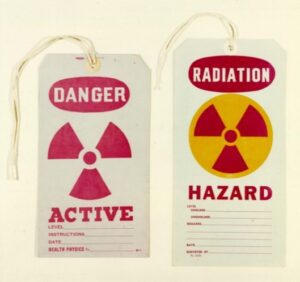
The life of the radioactive ‘trefoil’ began in 1946 at the University of California, Berkeley. The symbol was first ‘doodled’ by members of a research group headed by Nels Garden, who wrote in a letter that the symbol “would best symbolize the degree of hazard, type of activity, etc., but which was simple in design”. His brief gathered interest with the research group and a final design was chosen “which was supposed to represent activity radiating from an atom”; thus explaining the iconic dot and blade motif. Some early examples of its use are seen in Fig. 1.

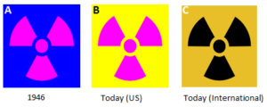
It was only in 1948 that the symbol came under consideration for wider use, when Brookhaven National Laboratory (DoE, New York) requested a “standardised symbol of standardised colours” for use in their radiation safety programme. Rather surprisingly, the first designs of the symbol weren’t the black and yellow that we are so familiar with. In fact, the choice of colours was of greater discussion than the symbol itself, with the original design having magenta blades on a blue background (Fig 2A). This blue background was chosen because it was an uncommon colour in radiation controlled areas; however, Oak Ridge National Laboratory (DoE, Tennessee) standardised the use of a yellow background later in 1948. By the late 1950’s, this radiation hazard symbol was implemented by the American National Standards Institute and federal regulation, and the design is still used in the U.S. today (Fig. 2B). Outside of the U.S., it is very common to see black blades in place of magenta (Fig. 2C).

After almost 70 years of use, has this trefoil symbol been a good choice in radiation safety? Well, it has certainly become an iconic emblem, both inside and outside of science, and I would agree that the simple design is effective at being a well-recognised hazard warning to those educated in its significance, but what about a person who has no learned knowledge of its meaning? The IAEA and the ISO have developed a new ionising radiation warning symbol for category 1, 2, and 3 sealed radioactive sources, to supplement the trefoil sign (Fig. 3). This updated pictogram provides a more intuitive depiction of the hazards and consequences of ionising radiation, which can be universally understood.
A Brief History of a “20th Century Danger Sign”, Lloyd D. Stephens and Rosemary Barrett, Health Physics Vol. 36 (May) pp. 565-571, 1979.
Health Physics: A Backward Glance, Kathren and Ziemer, Pergamon Press, 1980.
http://www-ns.iaea.org/tech-areas/radiation-safety/radiation-symbol.asp
Comments
Trackbacks
-
[…] known as the nuclear trefoil was first conceived in 1946. This universal sign was designed to represent the activity radiating from an atom. It is this sign that the design team took inspiration from for the series. After all, a […]
-
[…] precision of the details of this new symbol provides a more intuitive depiction of the radiating […]


Really interesting read, thanks Nathan! The new one certainly gets a clearer message across. I remember discussing the sort of signage left behind after closing a GDF, it would need to be understood thousands of years into the future, perhaps after significant change in language and knowledge. People had all sorts of crazy ideas.
I’ve always found the biohazard symbol much more terrifying (maybe because biohazards are much more terrifying?!), but I’ve noticed non-scientists getting them confused before. New signage could be a good thing for understanding.
Mark
Mark Williams
Growing up I had the pleasure early morning physics around the breakfast table with my father. Somewhere in my boxes of his books and papers I have a hard copy of “History of the radiation warning symbol”
The Ionizing Radiation symbols should represent the inverse Square concept! ANY energy but specifically ionizing Radiation. The Blades should be rotated 180 degrees. The three blades could represent 3 pi geometry and the trifoil blade spun 180 degrees would represent diminishing energy away from the point source! It only makes symbolic sense!